|
|
||
|---|---|---|
| OTF | ||
| Sources | ||
| Specimen | ||
| Webfonts | ||
| .gitignore | ||
| CosmicSansNeue.ttf | ||
| CosmicSansNeueMono.ttf | ||
| CosmicSansNeueMonoBold.ttf | ||
| Makefile | ||
| OFL.txt | ||
| README.md | ||
| pkg.sh | ||
| validate-generate.sh | ||
README.md
Cosmic Sans Neue Mono
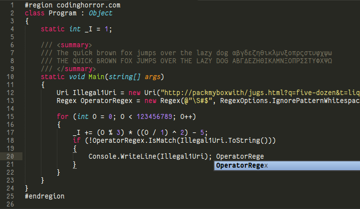
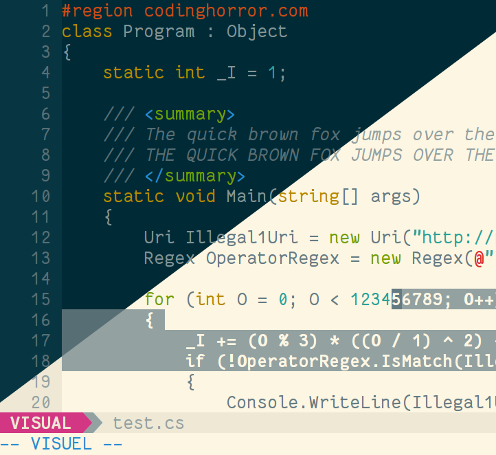
A programming font, designed with functionality in mind, and with some wibbly-wobbly handwriting-like fuzziness that makes it unassumingly cool.
Not related to other Cosmic Sans from the Internet. This one has Neue at the end, and it changes everything (most notably the coolness level). The name comes from my realization that at some point it looked like the mutant child of Comic Sans and Helvetica Neue. Hopefully it is not the case any more.
Inspirational sources include Inconsolata and Monaco. I have also been using Consolas a lot in my programming life, so it may have some points in common.
Weights, variants and glyph coverage
The font includes a bold version, with the same metrics as the regular one. Both versions include the same ranges of characters : latin letters, some accented glyphs (quite a lot), some greek letters, some arrows.
Please note that I have not tested all of the glyphs I have drawn (some letters have those two layers of crazy accents that I have never witnessed before), so it might look bad in some cases. Please report these problems: see next section.
It lacks a good italic version, which I plan to design later, in a fashion similar to Consolas' italic version, with new glyph designs, not just an added slant.
Author and license
Created by Jany Belluz <jany.belluz AT hotmail.fr>
Licensed under the SIL Open Font License (see OFL.txt).
Please send me an e-mail or report an issue on Github if you stumble upon bad design or rendering problems (with screen shot if possible), or if you need more characters, or if you want to compliment me (I love compliments).
Versions
1.1 - First release.
1.1.1 - Make slashes longer, ensure parenthesis and brackets are rendered at the same height, and some other minor adjustments.
1.2 - Add the bold version. Various minor adjustments, new paragraph symbol, slanted dollar.
1.2.1 - Minor adjustments.
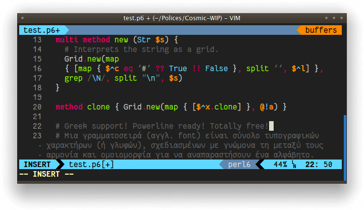
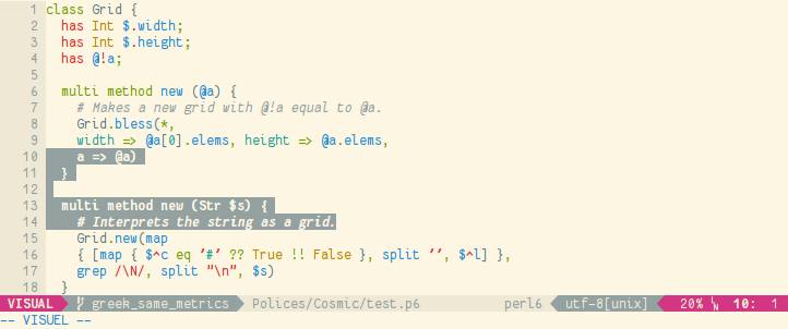
1.3 - Very slight change of metrics to add space between characters and lines. Various small changes : curlier curly brackets, more difference between various quotes, cleaner W, w, m, and rounder @. Windows compatibility. More latin accents. Greek letters. Powerline characters.
1.3.1 - Various fixes: still cleaning m and w, reworked all ogoneks, changed a
bit the dollar, moved some accents, eliminated glitches around
Powerline symbols.
TTF fonts are now hinted using Freetype's ttfautohint, which should
give much better results on Windows (and maybe in Java apps and others
contexts). In case this is a problem, please let me know and I will
provide also an unhinted version.
Windows users should use the TTF (TrueType) files.
1.3.2 - Various fixes: playing again with bold m, moving accents again, taking care again of Powerline symbols, clean 8 and R. Add a few box drawing characters (for use with vim-indentline). Generate webfonts (goal: this font used for code samples on all cool languages' websites). Add a WIP medium version of the proportional font.