| OTF | ||
| Sources | ||
| Specimen | ||
| .gitignore | ||
| CosmicSansNeueMono.ttf | ||
| CosmicSansNeueMonoBold.ttf | ||
| OFL.txt | ||
| README.md | ||
| zip.sh | ||
Cosmic Sans Neue Mono
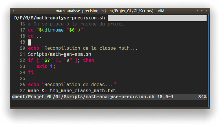
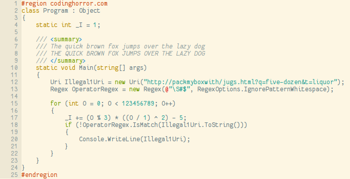
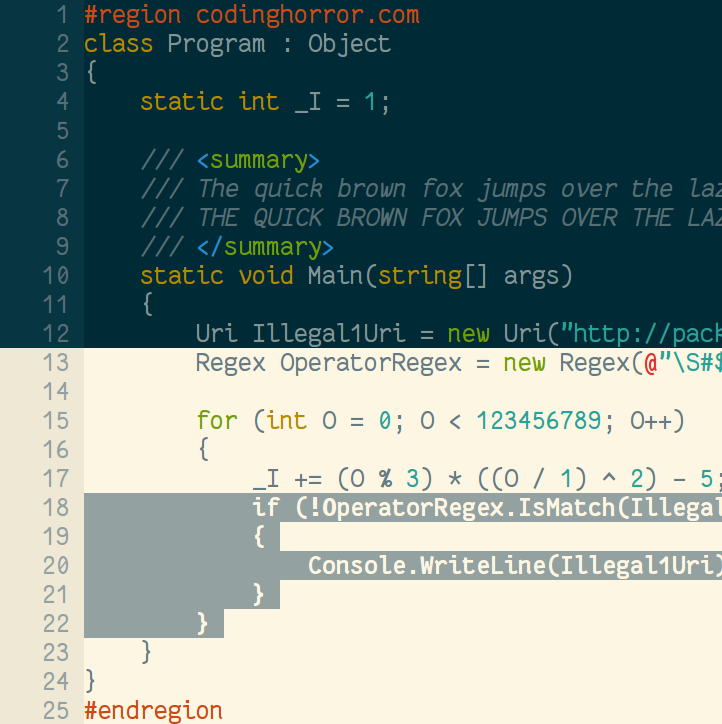
A programming font, designed with functionality in mind, and with some wibbly-wobbly handwriting-like fuzziness that makes it unassumingly cool.
Not related to other Cosmic Sans from the Internet. This one has Neue at the end, and it changes everything (most notably the coolness level). The name comes from my realization that at some point it looked like the mutant child of Comic Sans and Helvetica Neue. Hopefully it is not the case any more.
Inspirational sources include Inconsolata and Monaco. I have also been using Consolas a lot in my programming life, so it may have some points in common.
Weights, variants and glyph coverage
The font includes a bold version, with the same metrics as the regular one. Note however that I have not tested much the bold version yet, so it might look bad in some cases. Both versions include some accented glyphs, but this font does not have any kind of exhaustive coverage now.
It lacks a good italic version, which I plan to design later, in a fashion similar to Consolas' italic version, with new glyph designs, not just an added slant.
Author and license
Created by Jany Belluz <jany.belluz AT hotmail.fr>
Licensed under the SIL Open Font License (see OFL.txt).
Please send me an e-mail if you stumble upon bad design or rendering problems (with screen shot if possible), or if you need more characters, or if you want to compliment me (I love compliments).
Versions
1.1 - First release.
1.1.1 - Make slashes longer, ensure parenthesis and brackets are rendered at the same height, and some other minor adjustments.
1.2 - Add the bold version. Various minor adjustments, new paragraph symbol, slanted dollar.
1.2.1 - Minor adjustments.


